Chapter 5 Lets do some math!
5.1 Models
OK. There is no such thing as simple statistical model. However there are lots of packages that will make you suffer less. In fact this is one of biggest R advantages, that you can make even very sophisticated statistical modelling without any knowledge on programming since you use black boxes. When you are dealing with classic statistical models many of them are included in base R distribution – like linear or generalized additive models. You probably need to use mixed effect models, at some point. Good news is that there is a very nice and quite straightforward to use package called lme4. Every time you run into problem, and you do not know what to use for statistical modelling, or how to perform full procedure, just query Google. There are hundreds of blogs, web pages and Stack Overflow discussion on it.
Besides simple statistical models, there is a lot of other models. The scope of this book is not to discuss dichotomies in classification of models. To keep things simple, we will just stick to models that can be described with at least one of the following adjectives: stochastic, mechanistic or belong to differential equations systems.
5.2 Packages
Other, usually dynamic models, require more knowledge, experience and some packages. Before you start looking for more tailored solutions, install following packages: deSolve, fitdistrplus, rriskDistributions and truncdist. First one contains tools for solving differential equations sets, second and third provides you tools to deal with distributions (such as comparing distributions or estimating its parameters), and the last one allows you to use truncated distributions.
5.3 Simple mechanistic model and noise
To show some basic mechanistic model, we will use the well known Michaelis-Menten function: \(f(x) = \frac{ax}{b+x}\), with parameter a = 2.15 and parameter b = 0.08.
parA <- 2.15
parB <- 0.08
varX <- seq(0,1, length.out = 1000)
mmFunction <- parA * varX/(parB + varX)
plot(mmFunction~varX, type = 'l')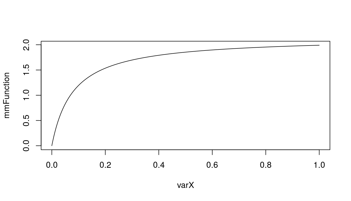
Figure 5.1: Simple Michaelis-Menten function
As you can see, as long as you have simple equation it is very straightforward to translate it into R. But we want something more useful, for instance adding noise or uncertainty to our model. Lets assume, that we are not sure what is the value of parameter a. Lets say that from previous research and expert knowledge we assume that it can be as high 2.5, but never is lower than 1.8. Also it usually takes value of 2.15. Knowing this we can use PERT distribution to include uncertainty in model.
library('mc2d')
sParA <- rpert(1000, 1.8, 2.15, 2.5)
parB <- 0.08
mmSAFunction <- sParA * varX/(parB + varX)
We added some uncertainty to our function. But what with parameter b, how our uncertainty on its value affects the outcome? Lets assume that it’s value is normally distributed with mean = 0.8 and sd = 0.23.
sParB <- rnorm(1000, 0.08, 0.023)
mmSABFunction <- sParA * varX/(sParB + varX)
Let me put this two functions on plots side by side:
par(mfrow = c(1,2))
plot(mmSAFunction~varX, type = 'l')
plot(mmSABFunction~varX, type = 'l')
par(mfrow = c(1,1))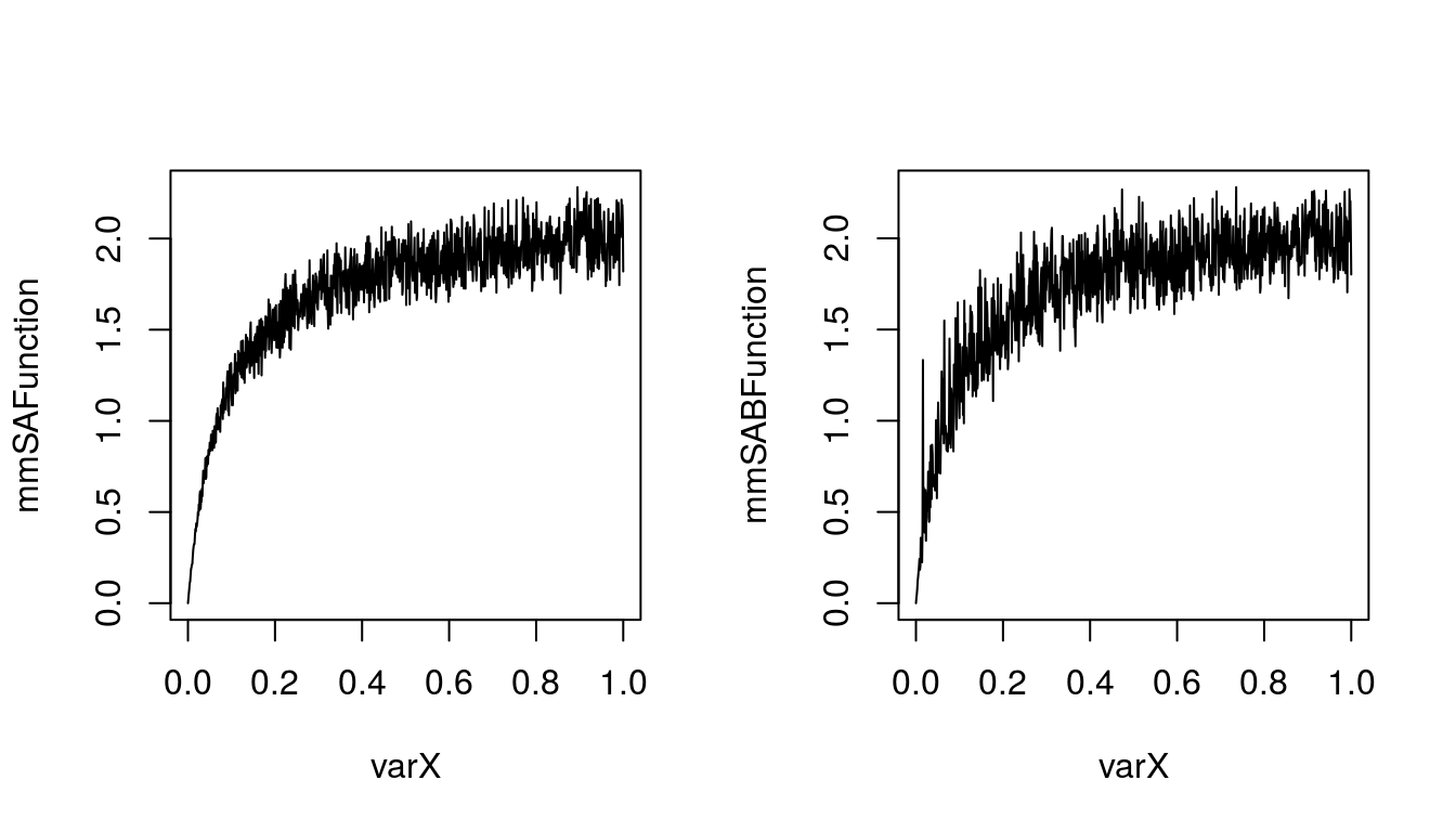
Figure 5.2: Michaelis-Menten function with stochastic parameter A (left) or A and B (right)
It seems that inclusion of uncertainty on value of parameter b does change our outcome. Lets also include some variability into the outcome. We can assume that for some reasons value of function will vary more than just our uncertainty about value of both parameters. And usually it varies from \(f(x)\) by some value from uniform distribution. The 25th and 75th percentile are given by: -0.13 and 0.17. To calculate parameters of this distribution we will use rriskDistributions package.
library('rriskDistributions')
unifParams <- get.unif.par(p = c(0.25, 0.75), q = c(-0.13, 0.17), plot = F)
fVariability <- runif(1000, min = unifParams[1], max = unifParams[2])
mmFSFunction <- ((sParA * varX/(sParB + varX)) + fVariability)
plot(mmFSFunction~varX, type = 'l')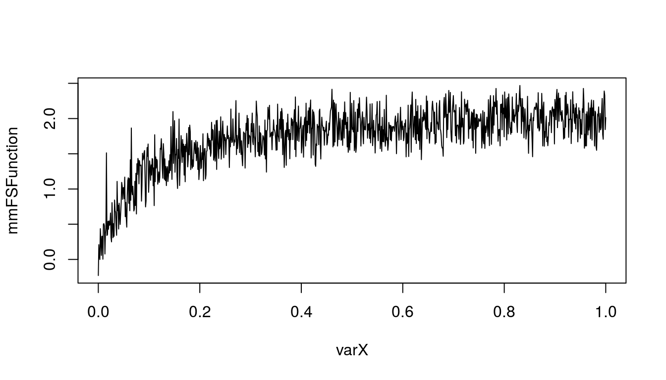
Figure 5.3: Michaelis-Menten function fully stochastic
It seems that there are differences between those three plots. So lets overlay them one on another to inspect visually differences.
plot(varX, mmFunction, type = 'l',
     col = 'black', ylim = c(0, 3),
     main = 'Michaelis-Menten function', xlab = 'x', ylab = 'f(x) = a*x/(b+x)')
lines(varX, mmSAFunction, col = 'blue')
lines(varX, mmSABFunction, col = 'green', lty = 'dashed')
lines(varX, mmFSFunction, col = 'red', lty = 'dotted')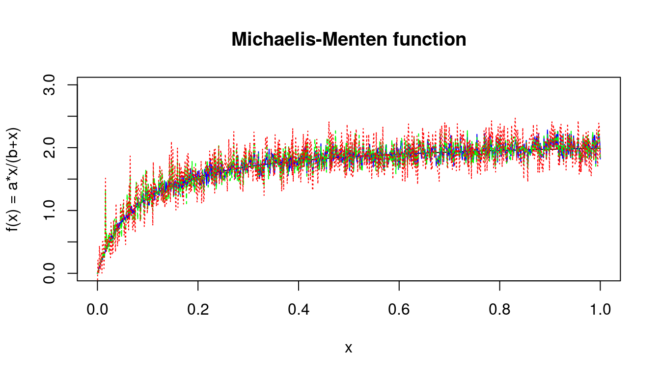
Figure 5.4: Michaelis-Menten function with different levels of stochasticity
5.4 Solving differential equations
5.4.1 The simple epidemiological
SIR (Susceptible, Infectious, Recovered) is a typical compartmental model for epidemiology. Since it has only 3 compartments, it is hard to find an easier one to model with differential equations. In our example we will use slightly more complicated example with four compartments – SEIR (Susceptible, Exposed, Infectious, Recovered). We begin with defining parameters of initial population. We need to define: birth and death rate, transmission (\(\beta\)), \(\gamma\) (\(\frac{1}{\gamma}\) defines infectious period) and \(\alpha\) (\(\frac{1}{\alpha}\) defines latent period). Than we define time and initial conditions – number of all specimens, population size, number of exposed, number of initially infected, number of initially recovered, which we combine in initial values vector.
Main step of this procedure is to define function which will be used to solve Ordinary Differential Equations (ODE). This function takes three parameter – t (which is time sequence), state (which are our initial conditions) and parameters. In the body of the function we define differential equations which connect our compartments. To solve the system of differential equations we use ode() function from deSolve package and save our results in modelOutput variable, which we will later use to make a plot.
parameters <- c(b     = 0.1,        # birth rate
                d     = 0.1,        # death rate
                beta  = 0.00025,    # transmission parameter
                gamma = 0.6,        # 1/gamma = infectious period
                a     = 0.1        # 1/a = latent period
                )

time <- 1:100

# Initial conditions
N = 15000    # population size
E0 = 150     # initialy exposed
I0 = 15      # initialy infected
R0 = 20      # initialy recovered

initial <- c(S = N - (E0 + I0 + R0), E = E0, I= I0, R = R0)

# ODE Model
fSEIR <- function(t, state, parameters) {
  with(as.list(c(state, parameters)), {
    dS = b * (S + E + I + R) - beta * S * I - d * S
    dE = beta * S * I - a * E - d * E
    dI = a * E - gamma * I - d * I
    dR = gamma * I - d * R
    return(list(c(dS, dE, dI, dR)))
  })
}

modelOutput <- deSolve::ode(y = initial, func = fSEIR, times = time, parms = parameters)
head(modelOutput)
## time S E I R
## [1,] 1 14815.00 150.0000 15.00000 20.00000
## [2,] 2 14771.93 180.7236 19.41006 27.94129
## [3,] 3 14717.22 220.8724 24.19132 37.72072
## [4,] 4 14649.90 270.7314 29.83648 49.53296
## [5,] 5 14567.85 331.7169 36.66138 63.77320
## [6,] 6 14468.27 405.8173 44.94943 80.966185.4.2 Ploting SERI model
To create a plot using our favorite library ggplot2 (which will be described with more details in chapter 7) we first need to convert our modelOutput to object of class data frame. Than we can use code below to plot our model.
modelOutput <- as.data.frame(modelOutput)
ggplot(modelOutput, aes(x = time)) +
  geom_line(aes(y = S, colour = "S")) +
  geom_line(aes(y = E, colour = "E")) +
  geom_line(aes(y = I, colour = "I")) +
  geom_line(aes(y = R, colour = "R"))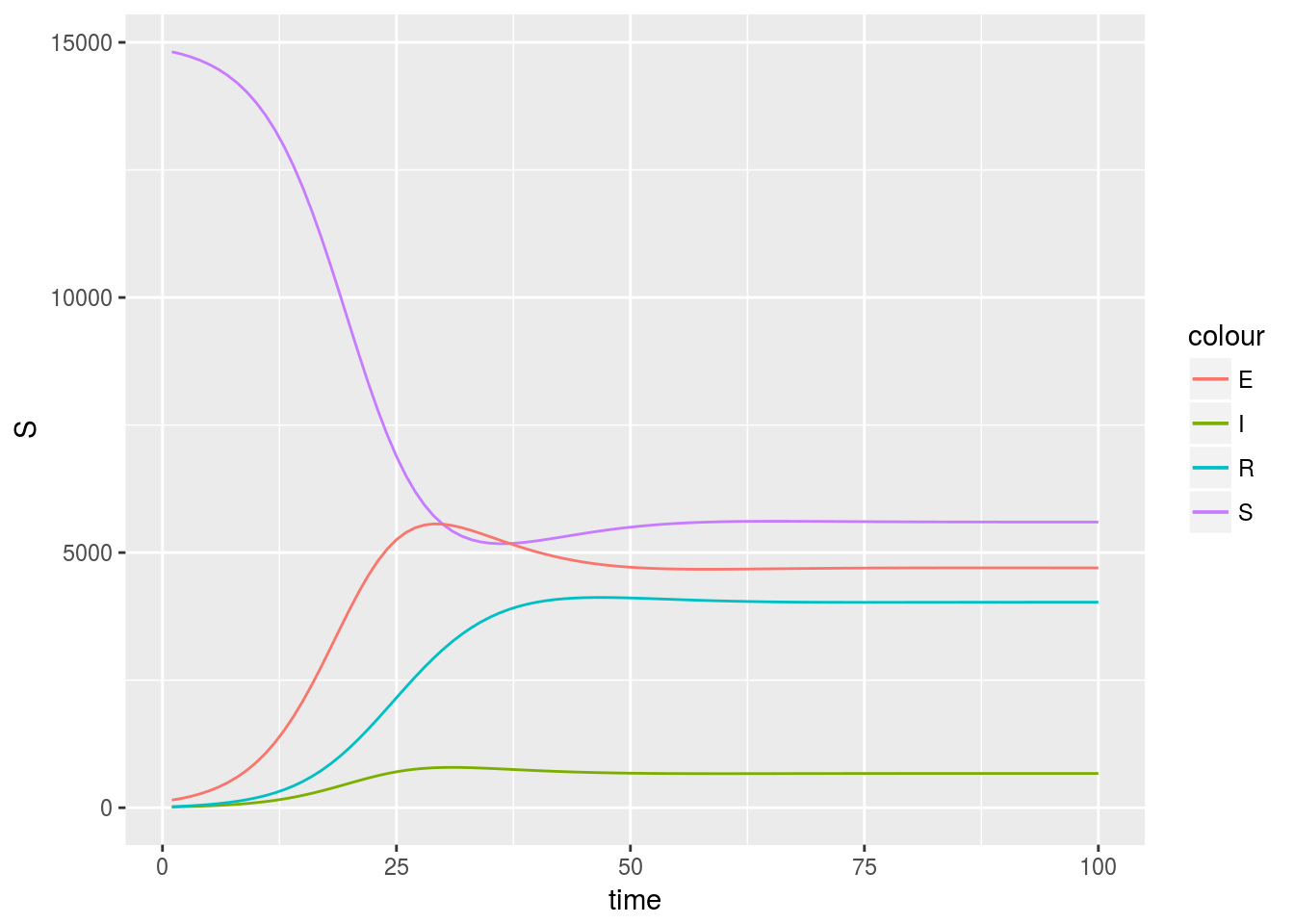
However, the element geom_line is repeated four times, which does not look nice. We can change it with little effort, and also define some better aesthetics:
modelOutput <- as.data.frame(modelOutput) %>%
  gather(key = compartment, value = value, -time) %>%
  left_join(data.frame(compartment = c("S", "E", "I", "R"),
                       ordered = 1:4,
                       stringsAsFactors = F), by = 'compartment')
ggplot(modelOutput, aes(x = time, y = value,
                        colour = reorder(compartment, ordered))) +
  geom_line() +
  viridis::scale_colour_viridis(discrete = T) +
  theme_bw() +
  theme(panel.grid.major.y = element_line(colour = "#dfdfdf")) +
  labs(colour = 'Compartment',
       x = 'Time',
       y = 'Population size',
       title = 'SERI epidemiological model')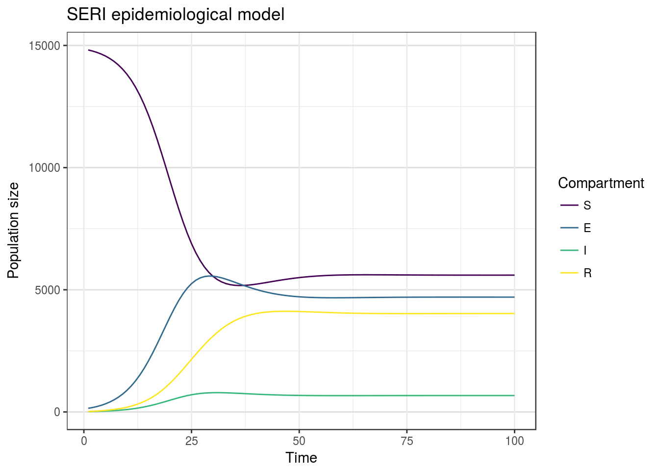
You might wonder why we added additional column to modelOutput data frame. The thing is that ggplot automatically maps some aesthetics to groups using alphabetical order. Created column in which we store numbers that refer to compartment order in SERI acronym. Than we use it as argument to reorder function inside ggplot, which under the hood transforms variable to factor and change level orders. Using this approach, we don’t need to change all the orderings of variables and aesthetics manually. I also used color palette from *viridis package, which contains four nice looking color palettes, which are colorblind safe (at least in theory).