Chapter 7 Graphics
What would be our work value without visualization? Not much. R provides use with some tools to make plots, charts and other visual stuff. However base version has very limited graphic design by default and making it pretty needs a lot of time and code. Nowadays, however, in tidyverse there is a very powerful library with dozens of extensions - ggplot2. GG stands for Gramar of Graphics and in practice it means that we build our visualization layer after layer. The vast spectrum of ggplot functions and its extensions is out of the scope of this book. Here we will focus on the basic and most useful things as well as how to find not so common functionalities.
7.1 Base plots
Before we get to ggplot2, we should begin with base graphic functions. It is true that the do not look as pretty as plots from dedicated libraries, but they are extremely useful in quick checking of our workflow. Not to mention, that many packages are still operating with old fashioned base graphics.
7.2 How to make plot?
In previous chapters we made some plots, but we did not cover the details. Most important thing is to acknowledge that we can make plots with hist(), plot(), barplot() and boxplot() functions (to mention only the most common). There are of course other types of plots you might need, however those three are the classic ones. If you are looking for more examples of base plots, you should visit help page of graphics package. To change the look of your plot, just provide proper arguments to this function, like col for color of line/points or, xlab and ylab to change names of axis labels. Unfortunately a list of arguments that you can control and adjust is long. The good news is that all of them have their default value, so you need to change only the ones you want, without thinking about rest. Full list of parameter you can change you will find after executing: ?par command. As this help page contains many different kinds of parameters you should scroll to find Graphical Parameters chapter.
7.3 Can we actually do something?
Yes we can. But as I said earlier scope of this book is not graphics. Thus I will cover here only the basic things you should know, or at least know where to find them. Bellow, I will present only code and its output (Fig. 7.1). After what you read, you should be perfectly fine with figuring out what is going on. You can also copy - paste the code in your script or console, edit it and learn how it works by doing. Even the best book is just a book, and nothing will substitute the knowledge you gain by experiencing.
graphicDummy <- data.frame(x = rnorm(100, 10, 2), y = rpois(100, 1.2))
par(mfrow = c(2,4))
plot(graphicDummy$x~graphicDummy$y)
plot(graphicDummy$x~as.factor(graphicDummy$y))
boxplot(graphicDummy$x~graphicDummy$y, main = 'Boxplot')
barplot(graphicDummy$x, main = 'Barplot')
hist(graphicDummy$x, main = 'Histogram x')
hist(graphicDummy$y, main = 'Histogram y')
plot(density(graphicDummy$x), main = 'Density x')
plot(density(graphicDummy$y), main = 'Density y')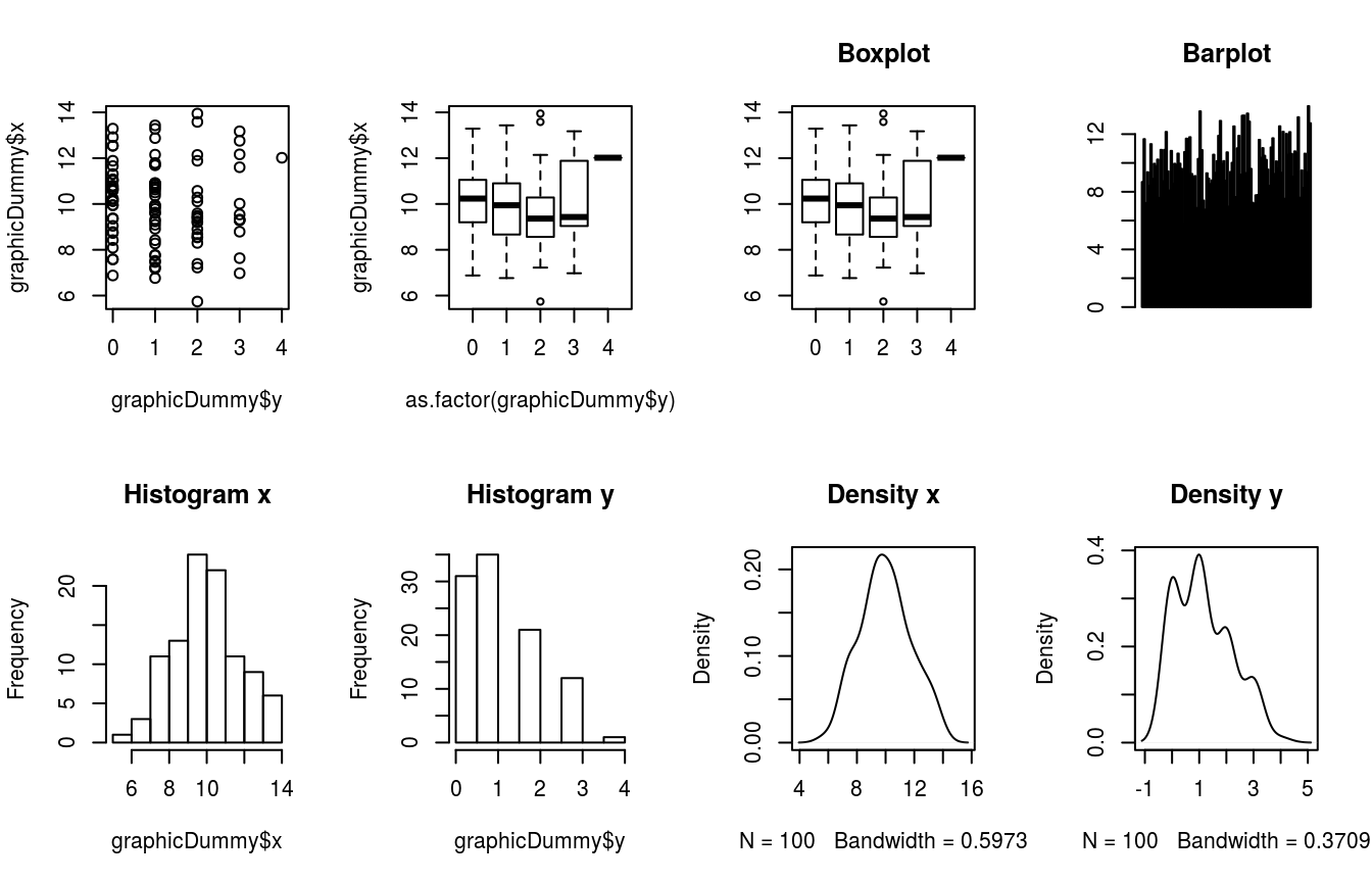
Figure 7.1: Base plots and histograms
7.4 ggplot2 - Graphics taken into other dimension
This package use different approach to make plots and charts (however it is not limited to only those). The philosophy it follows is called Grammar of Graphics (Wilkinson 2005; Wickham 2010). Within this workframe, we build whole plot (chart, etc.) by adding layer after layer of visual options. With great power comes great responsibility – ggplot2 as well as it’s extensions are highly customisable, thus if you want to use non-default settings it may take some time before you figure out how to do it. Here we will briefly cover the most basic stuff, but there is very good book that goes deeper into manipulation of visual effects, with lots of examples – R Graphics Cookbook (Chang 2013) which is also available on line.
7.4.1 Basic plot in ggplot2
Making basic scatterplot (Fig. 7.2) requires defining 2 layers:
- Data
- Type of plot/chart
plotTable <- data.frame(time = 1:10,
                        depVal = c((1:10)*2)+2,
                        typeDep = rep(c('first', 'second'), times = 5))
basePlot <- ggplot(plotTable, aes(x = time, y = depVal)) +
  geom_point(aes(colour = typeDep, alpha = 0.8, shape = typeDep, size = 3.5),
             show.legend = FALSE)
basePlot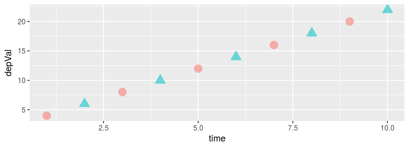
Figure 7.2: Basic scatterplot
In the function call (1st layer), we define data set (plotTable) and aesthetics (x and y values). In following layer, we define 3 aesthetics – colour, alpha, shape of points and their size. We also tell ggplot to not to make legend. Unfortunately, when you first start working with ggplot (and even when you have some experience), you will often run into small problems that will need some adjustments in your code. Hopefully, this package is so broadly used that you will easily find a lot of solution of your problems on Stack Overflow, as well as many extensions with predefined functions to make sophisticated graphics.
Lets take a little deeper look into layers and aesthetics. Default look of plot is little bit boring, and usually unsuitable for publications. In code below we will use another layer – theme – to define plot background, plot name and axis names (Fig. 7.3). Of course, this still is unsuitable for publication, however it looks more fancy and can be used in presentation, poster or on blog.
basePlot +
  labs(title = 'Basic dot plot', x = 'Time', y = 'Dependent variable') +
  theme(axis.title.x     = element_text(size = rel(0.7), colour = 'red'),
        axis.title.y     = element_text(size = rel(1.1)),
        plot.background  = element_rect(fill = 'yellow'),
        panel.background = element_rect(fill = 'pink'),
        panel.grid       = element_blank(),
        title            = element_text(size = rel(1.3),
                                        colour = 'gray50',
                                        face = 'bold'))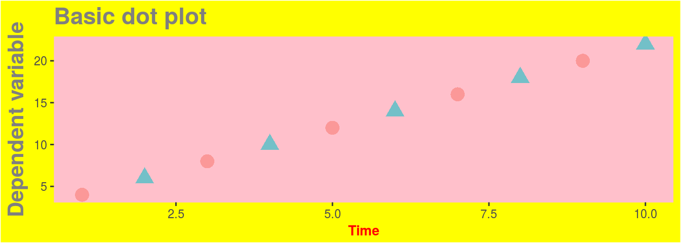
Figure 7.3: Scatterplot with additional aesthetics
Beautiful!
However we can use simple trick to make our plot in format that is actually supported by scientific journals (Fig. 7.4), i.e. white background, no gridlines etc.:
basePlot +
  labs(title = 'Basic dot plot', x = 'Time', y = 'Dependent variable') +
  theme_bw() +
  theme(panel.grid = element_blank())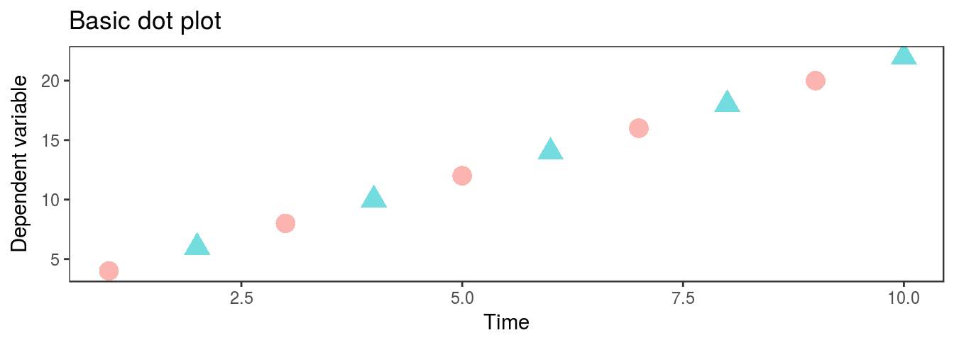
Figure 7.4: Scatterplot formated for journals
7.4.2 Density plots
But what if we want to actually plot something useful? Lets say that we want to graphically compare distributions of two data sets. We can do it by histograms (boring) or by plotting density functions. First we should generate some data. Assume that you are tossing coin, but you have this strange gut feeling that something is not right. In 500 trials you had 218 tails and 282 heads. Fig. 7.5 shows simple density plot made with ggplot
coinDensity <- data.frame(coin = c(rep(1, times = 282), rep(0, times = 218)))
ggplot(coinDensity, aes(x = coin)) + geom_density()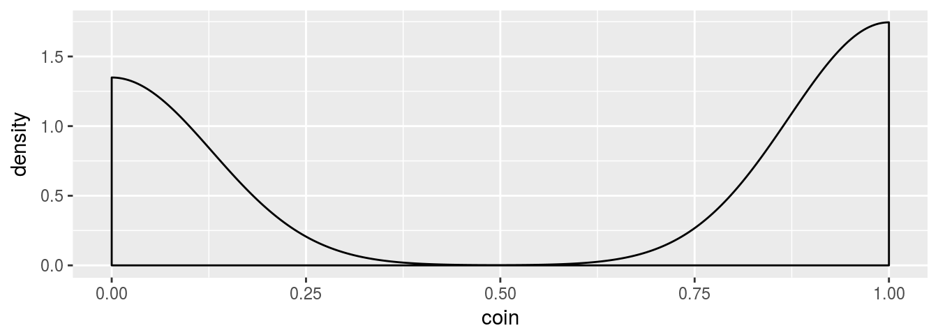
Figure 7.5: Simple density plot for coin tossing
And we want to check if it is really different from binomial distribution (Fig. 7.6).
tCoinDensity <- data.frame(coin = rbinom(500, 1, 0.5))
ggplot(tCoinDensity, aes(x = coin)) + geom_density()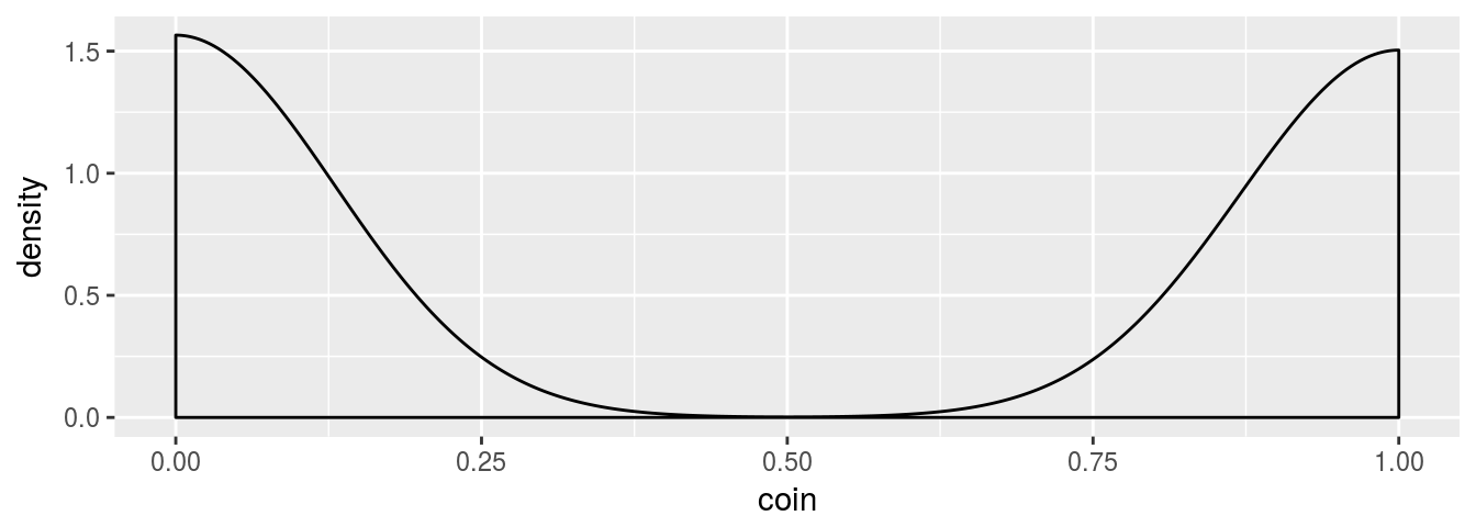
Figure 7.6: Density plot for binomial distribution
Now we have two plots which is not the best way to visually check two distributions. It would be much better if we plot them one by one, preferably with different colors and opacity (like in Fig. 7.7). Below it’s short code snippet how to do it in R.
coinTest <- bind_rows(coinDensity, tCoinDensity) %>%
  bind_cols(distribution = rep(c('empirical', 'theoretical'), each = 500))
ggplot(coinTest, aes(x = coin, fill = distribution)) +
  geom_density(alpha = 0.7, colour = 'yellow') +
  scale_fill_manual(values = c('blue', 'violet'))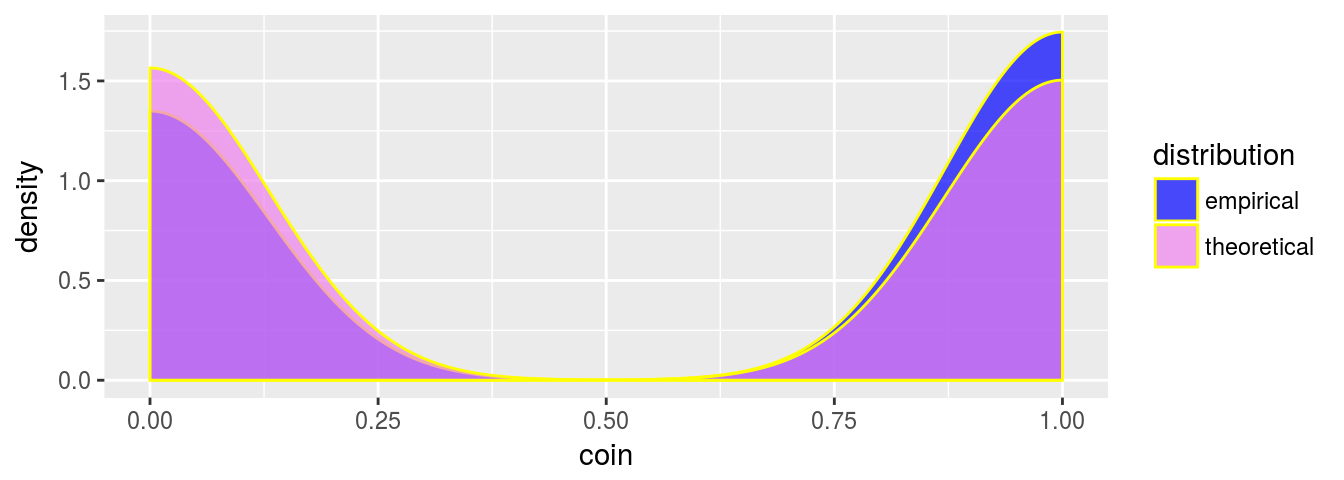
Figure 7.7: Combined density plots
Indeed, the coin is slightly biased towards heads.
7.4.3 Box-plot and bar-plot
When dealing with comparison of two or more groups we usually check their distribution by visually inspecting so called box plots or box-whiskers plots. This plot shows interquartile range (IQR) as box, median as a line inside box, 1.5 IQR as whiskers and all of the data points that are more than 1st quartile - 1.5 IQR or 3rd quartile + 1.5 IRQ as separated dots called outliers. There are few different approaches to define outlieres and whiskers in box plots, nonetheless above is most common. It is very straightforward to make box-plots (Fig. 7.8) with ggplot2:
boxGroups <- data.frame(group = rep(c('normal', 'chisq', 'pois'), each = 100),
                        values = c(rnorm(100, 3, 0.65), rchisq(100, 3), rpois(100, 3)))
ggplot(boxGroups, aes(x = group, y = values)) +
  geom_boxplot()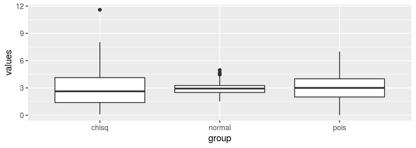
Figure 7.8: Box-plot of three groups
Bar-plots are mainly used to show categorical variables as rectangles with height (length) that is proportional to highest value that each categorical variable represents. ggplot syntax sometimes is tricky. Unfortunately, that is the case when dealing with bar plots. Consider below example and try to figure out what happened on Fig. 7.9:
barGroups <- boxGroups
ggplot(barGroups, aes(x = group)) +
  geom_bar(stat = 'count')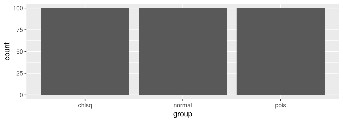
Figure 7.9: Mysterious bar-plot
Instead of having bars that length represents highest value for each group, we created bar plot where length of bar is proportional to number of records in all group, i.e. 100. Depending on what value we are interested, we can take different approaches to solve this problem. First, instead of using geom_bar layer we can use geom_col. It will allow us to represent sum of values in particular group (Fig. 7.10).
brGroups <- boxGroups
ggplot(brGroups, aes(x = group, y = values)) +
  geom_col()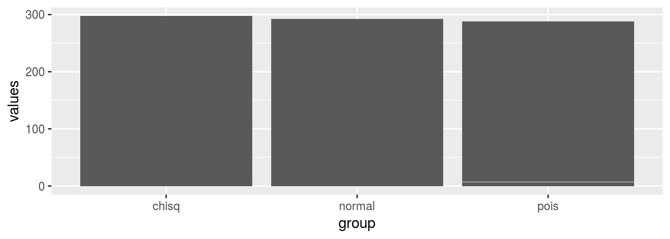
Figure 7.10: Sums by group bar-plot
In the second approach, we first need to transform our data, so for each group and we calculate a value that will be represented as length of bar. This method gives us a lot of flexibility. We can calculate number of cases, mean, standard deviation, maximum value, while changing only one command and update plot to show different measures. Below you find code how to plot maximum values for each group on bar-plot (Fig. 7.11).
barGroups <- boxGroups %>% group_by(group) %>% summarise(grVal = max(values))
ggplot(barGroups, aes(x = group, y = grVal)) +
  geom_bar(stat = 'identity')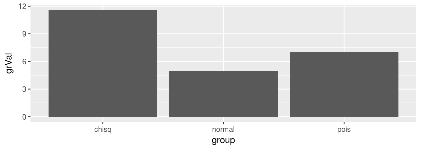
Figure 7.11: Maximum value by group bar-plot
7.4.4 Regression
Last common visualization is regression plot. With layer by layer approach we can control all the elements of the plot. Below code shows how you can visualize both dots and lines for regression, change title and labels and set some non standard appearance of plot (Fig. 7.12).
regVar <- c(sample(1:20, 100, replace = T))
regRes <- ((regVar * 2.6) + 0.8) + order(rnorm(100, 10, 4.25))
regDF <- data.frame(x = regVar, y = regRes)
ggplot(regDF, aes(x, y)) +
  geom_point(fill = 'yellow', colour = '#ff0099', shape = 21, stroke = 1.15) +
  geom_ribbon(stat='smooth', method = "lm", se = TRUE,
              fill = '#990011', colour = 'yellow', alpha = 0.4,
              linetype = 3, size = 0.2) +
  geom_line(stat='smooth', method = "lm",
            colour = 'green', alpha = 1,
            linetype = 4, size = 1.15) +
  theme(panel.background = element_rect(fill = NA),
        axis.line = element_line(size = 1.15, colour = 'grey')) +
  labs(x = 'Values of X',
       y = 'y = 2.6 * x + 0.8',
       title = 'Example of regression plot') +
  annotate('text', label = 'y==2.6*x+0.8+epsilon', parse = T,
           x = 3.5, y = 135, colour = 'blue')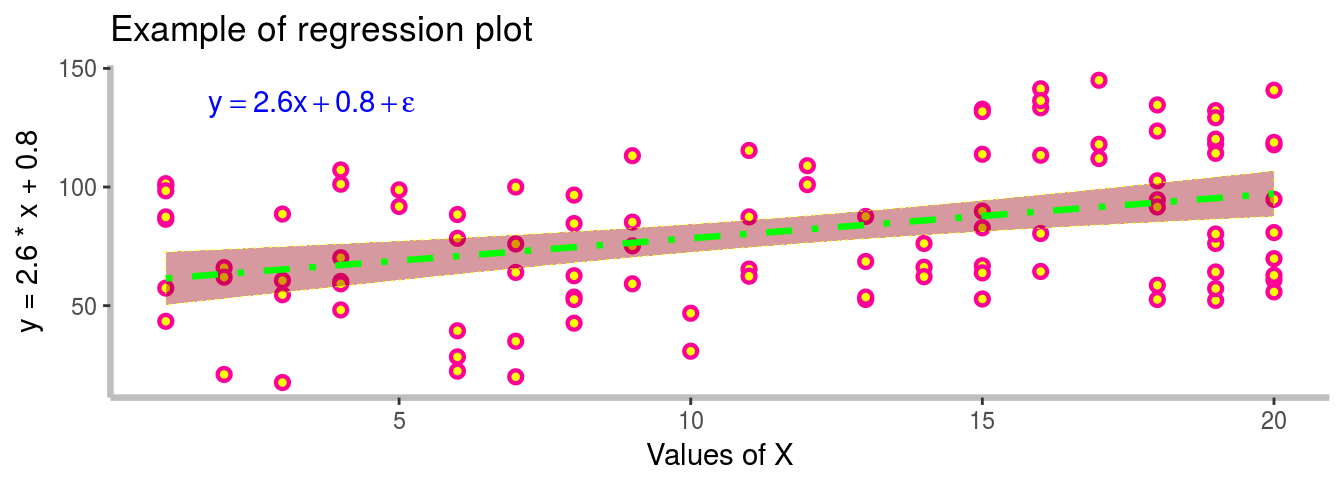
Figure 7.12: Formated Regression plot with 95% CI
References
Wilkinson, Leland. 2005. The Grammar of Graphics (Statistics and Computing). Secaucus, NJ, USA: Springer-Verlag New York, Inc.
Wickham, Hadley. 2010. “A Layered Grammar of Graphics.” Journal of Computational and Graphical Statistics 19 (1): 3–28. doi:10.1198/jcgs.2009.07098.
Chang, Winston. 2013. R Graphics Cookbook. O’Reilly Media, Inc.